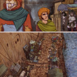
Page 1
So, as we were trying to upload the page on Friday, I made the fatal error of trying to update plugins while the post was not yet up. I’m not sure if I broke something or if the site just broke itself, but I couldn’t access my dashboard to do anything after that. We slept on it hoping that it would fix itself, but it didn’t. A few pearl-clutchy messages/calls later, our amazing friend John who made and hosts our site for us, managed to get things sorted. THANK YOU, JOHN! <3
Anyway. Back to our scheduled programming…
The last panel with the market scene took us forever to do. +_+ On top of that, we spent our entire weekend last week doing a really fun project at the Book Lounge! We painted a huge window mural with our friend Deon de Lange in anticipation of Open Book Comics Fest which will be happening again in September! I’ll put some pictures in the next blog post. They are on our Facebook page too, if you can’t wait that long.
Thanks again for your patience. We really appreciate you sticking around.
<3
PS: We put so much detail into this page and are kind of sad that the resize and text made most of it disappear. So here is a zoomed-in, text-free crop of the bottom part of the page!
9 Comments
What's on your mind?
Site & contents © Ben G Geldenhuys & Danelle Malan. Do not redistribute without written permission.
Built with WordPress and wine by @avesse.


Welcome back, and what a nice way to return to the comic. A fully detailed look of the port!
I’m curious though: What prompted the removal of the space and the shrinking of the S in the title?
Thanks! And it just kind of happened. The intent was always to write it as one word but in the early days when Ben was playing around with the logo, breaking the word up over two lines made for a more compact logo which was useful for several things. That gives it the impression that it is two separate words when it’s actually just a typographical/design decision. To date, we still use two different versions – the compact and the elongated.
Domino actually named her ship after her sewing machine. We want to touch on it later in the comic but it might end up being a side-story that we include in the volume.
Ahhh, I see. So it was meant to be a single word from the start.
With the compact version, a hyphen after the N and keeping the S small would have prevented the confusion. The best example I can show is a cereal here in the States.
I get what you mean. The logo will probably end up with a bunch of revisions in the future anyway so we’ll see how it goes!
i’m glad you’re back and i hope you’re having a great time do whatever you’re doing
Thank you! 😀 It’s good to be back!
Beautiful page. Love the banter.
Also, they’re is an unneeded quote hanging out after “frowned upon”…
D’oh!
“There” not “They’re”. Hate it when I typo in a typo report!
Oh whoops you’re right! Thanks for pointing that out!